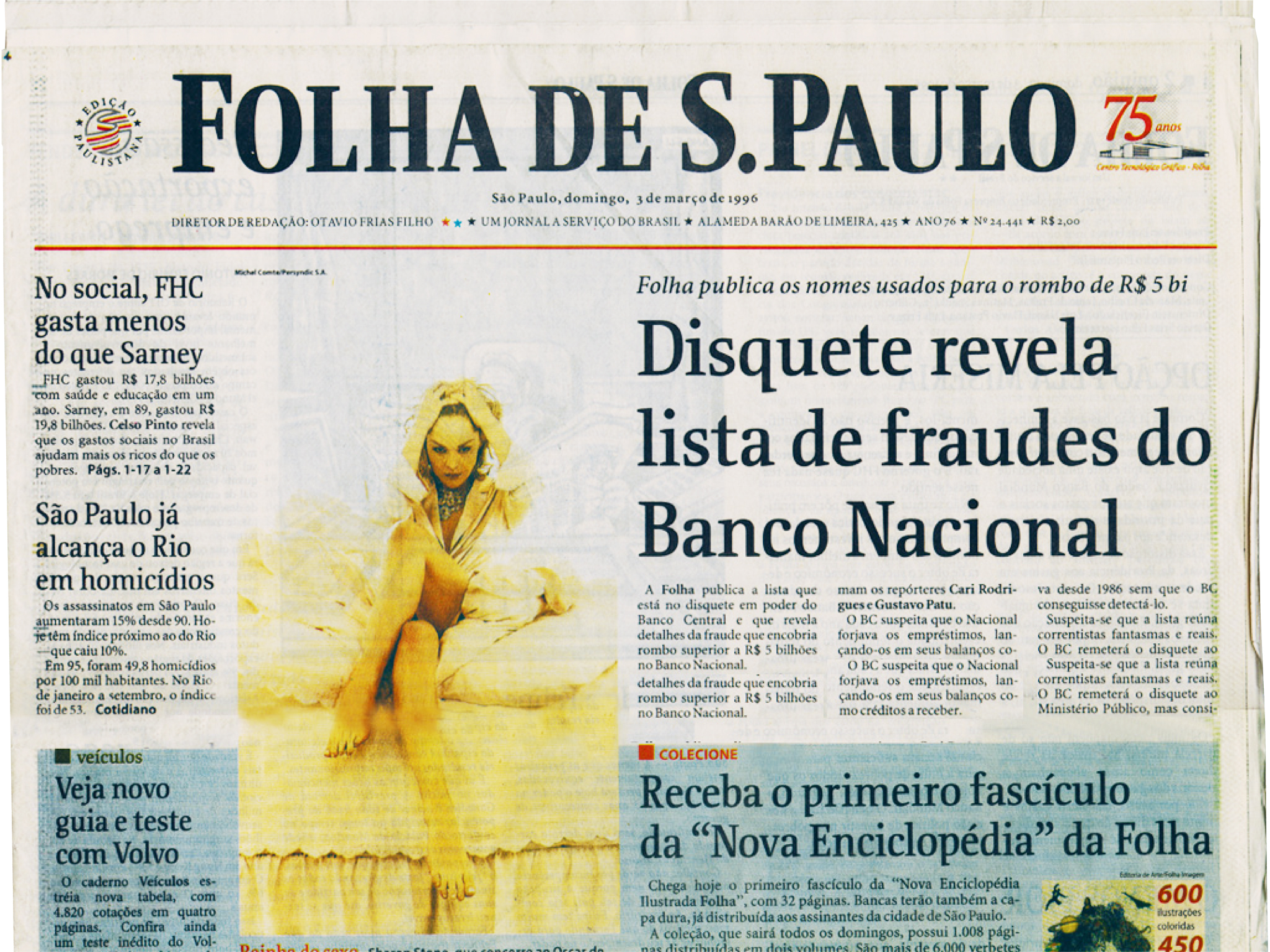
Folha de São Paulo
For several years during the early and mid-1990s, Luc(as) de Groot was the Typographic Director at MetaDesign in Berlin’s exciting Kreuzberg district. Erik Spiekermann had founded this company in 1979. After one of their competitors was redesigned by a famous international publication designer, the Brazilian daily newspaper Folha de São Paulo decided that they needed a refresh, too. They called Spiekermann, who tasked Luc(as) with the work.
Before MetaDesign came onto the scene, Folha de São Paulo’s main typeface was Times New Roman. Luc(as) decided to replace this with a specific instance of Minion that he generated from the three-axis MinionMM MultipleMaster font. He then edited that instance further by hand, making it even more suitable for newspaper body copy. Luc(as) paired this text face with a brand new design he would specific for Folha de São Paulo’s headlines. Unlike the text type, this display face was not generated from other computer files but started out as sketches on paper. Luc(as) made drawing of the letters by hand and then played around with white-out and photocopy machines a lot until he arrived at the shapes he wanted.
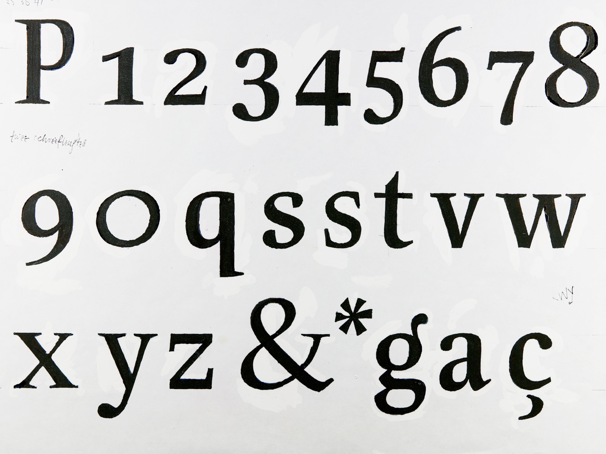
The Folha de São Paulo headline typeface was based on broad-nib calligraphy. Luc(as) used the methods for creating letters in this style from his teacher at the Royal Academy of Art in The Hague (KABK), Gerrit Noordzij. Luc(as) made sure to keep the typeface’s letterforms lively as he designed and edited them. This was important to the newspaper’s overall impression, because in 1994 Folha de São Paulo printed almost every page in a 4-color process, a fact that was really sensational for the time. In Europe, most newspapers still kept the majority of their editions’ pages in black and white. Luc(as) needed a typeface with energy to match the color and freshness that was already part of Folha de São Paulo’s pages.
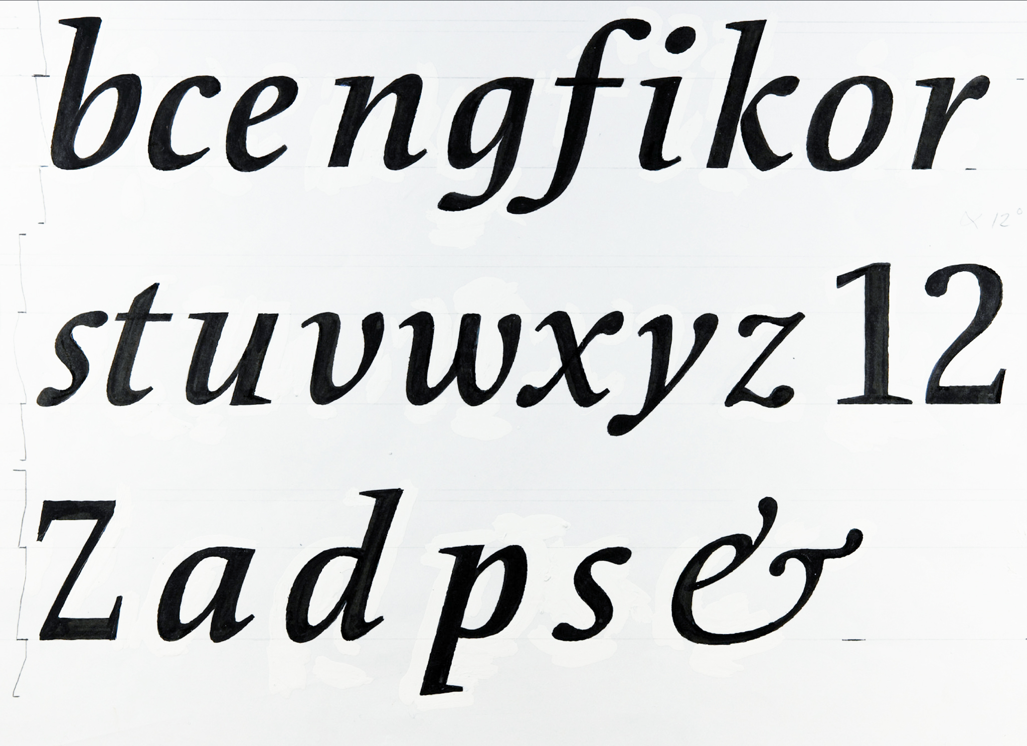
After drawing the upright version of the Folha de São Paulo headline typeface, Luc(as) went to work on the italic. He got this right on the very first drawing. The letters had a 12° angle. All in all, he made four styles of this typeface: in addition to regular and italic, it had a semibold and a bold font, too. The semibold and bold fonts were quite similar in weight because Luc(as) knew that they would each be used to set headlines of very different sizes; he drew each font for a specific purpose within the newspaper’s overall redesign. This typeface family received the name Folha Serif.
After redesigning the newspaper’s nameplate to match Folha Serif, he then began to kern the Fohla Serif fonts, and this presented some difficulties. The newspaper was not laid out with DTP software – back then, both Aldus PageMaker and QuarkXPress were common – but rather with a Harris typesetting system instead. This had a strict limitation in the number of total kerning pairs it could support. Normally, a font is kerned to work with dozens of European languages, but that would have created a total of thousands or tens of thousands of pairs, and the system could only handle 600. Luc(as) solution was to examine a corpus of Brazilian Portuguese words to determine which letter pairs were used in the language and then only kern the font to support those. This was the beginning of a new scientific branch that Luc(as) helped invent: the science of Kernologica.
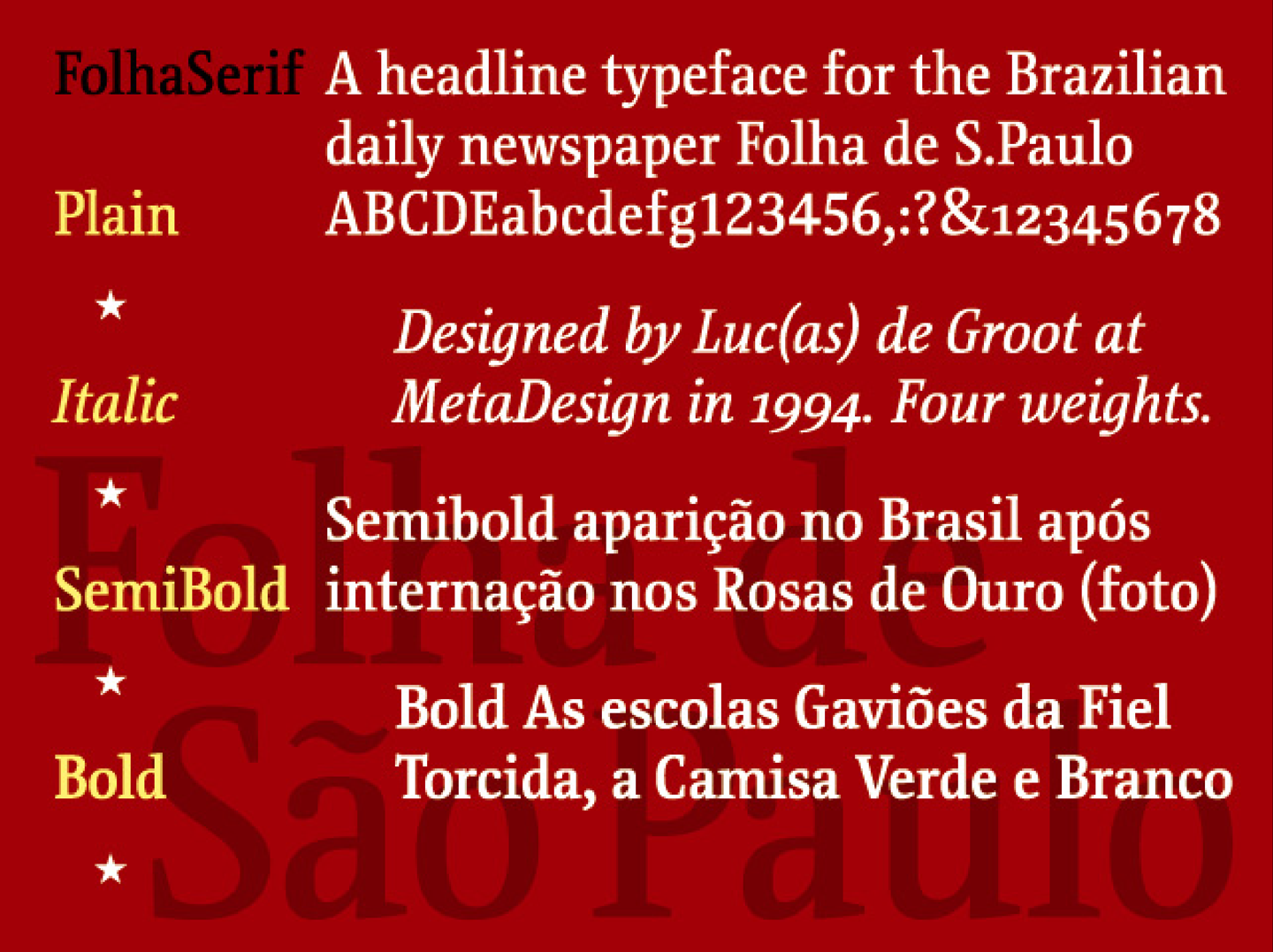
After Luc(as) left MetaDesign, he set-up FontFabrik. He kept Folha de São Paulo as a client and made two more styles of Folha Serif for them. But this was not the end of the Folha Serif story. In fact, it was just the beginning.
The Le Monde newspaper in Paris became aware of the design and wanted to use it as well. Luc(as) created an alternate version of the Fohla Serif design, whose characters were much narrower, with different serifs. The letters’ x-height was also taller in the Le Monde version. Since Luc(as) couldn’t very well name a font family for Le Monde after Folha de São Paulo, he named the new typeface Floris Newspaper (Floris is also the name of Luc(as)’s son).
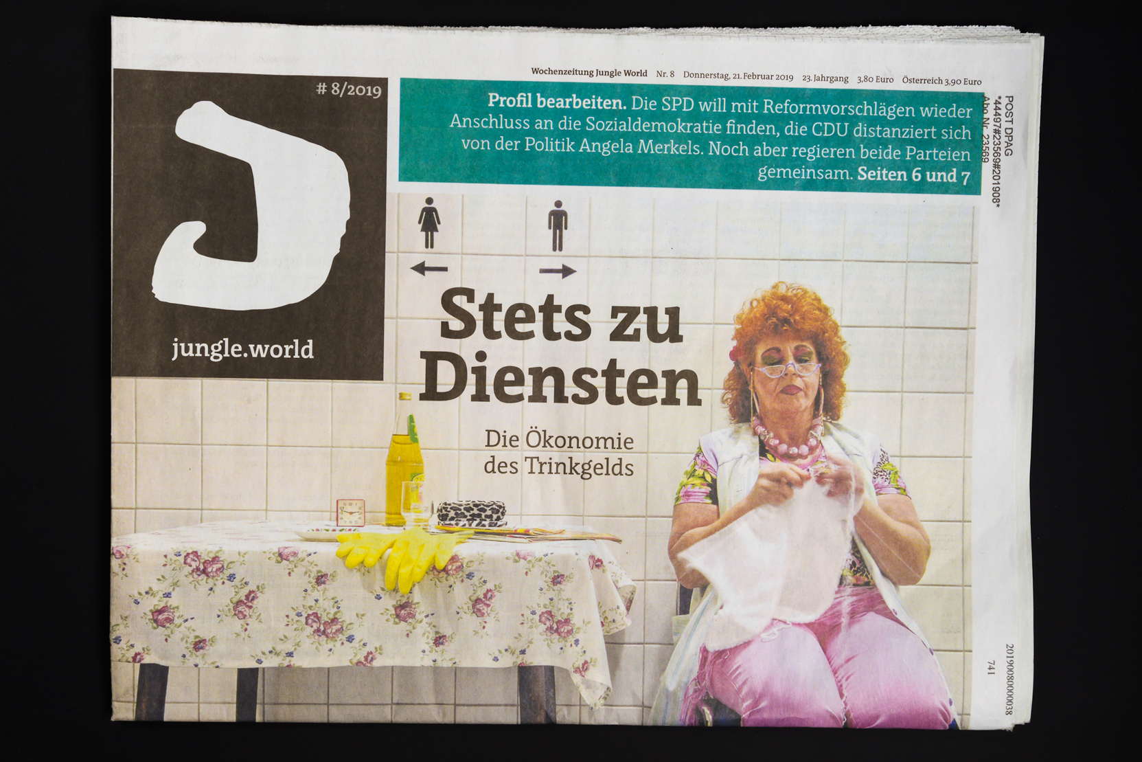
Seeing the narrower Floris Newspaper, Luc(as) realised that the underlying Fohla Serif/Floris design still had a lot of potential. He then started a new typeface, with six different MultipleMaster axes (one each for weight, width, three, four, five, and contrast). Almost 20 years later, this gigantic family is still not finished. Part of the problem is that Luc(as)’s design is far more advanced and complicated than normal font-editor can visualise or even edit comfortably. So Luc(as) is waiting for software to catch up with his design. Still, parts of this expanded Floris family are available for licensing at LucasFonts.com, and some of it is used in headlines for yet another newspaper: JungleWorld, published in Berlin.
